Timeline
May-June 2026
Role
UX designer (research, testing and design)
Team
Individual project
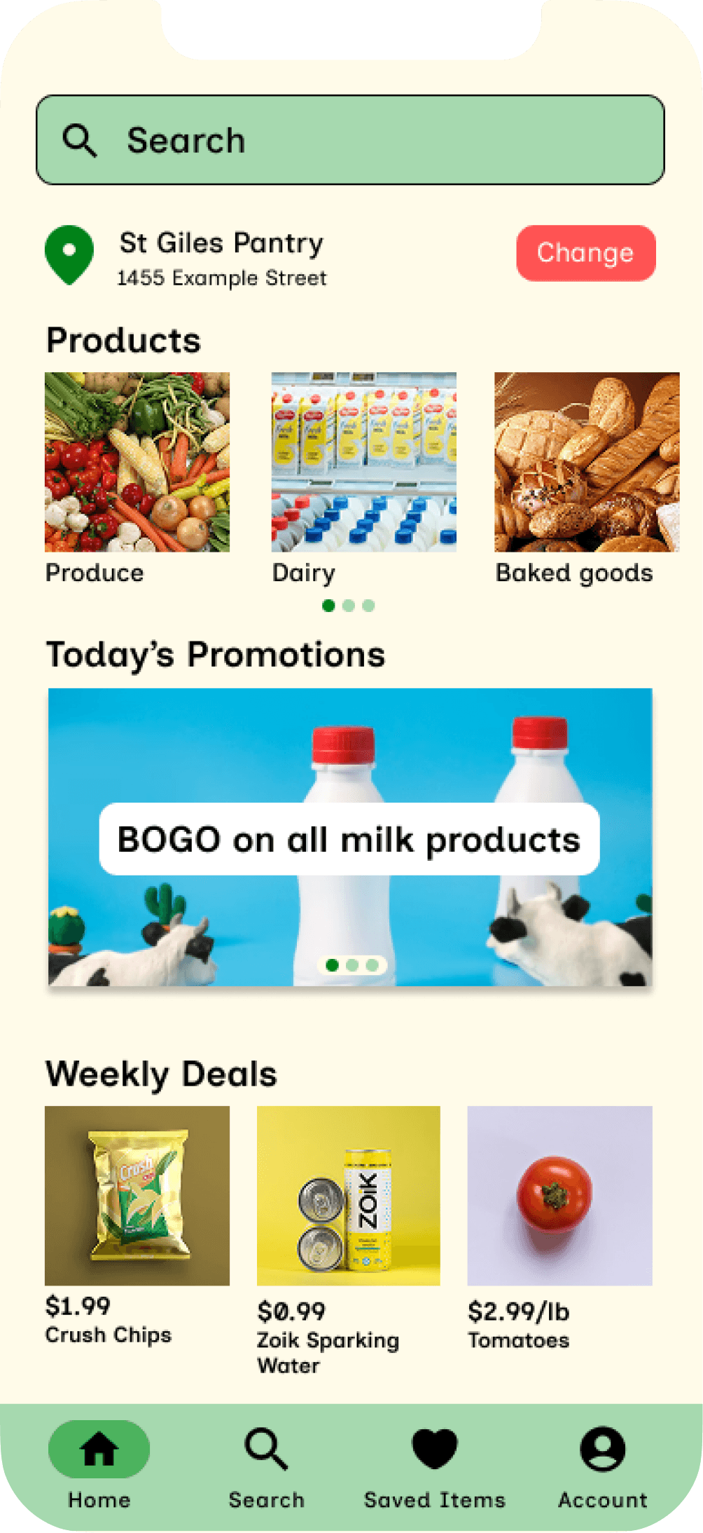
Sometimes a five minute grocery run can turn into 20 minutes of wandering aisles or flagging down employees just to find one item. After conducting user research I learned that the problem wasn’t a lack of in store help but rather shoppers couldn’t tell where an item was or if it was in stock. Grocer solves these problems by helping shoppers locate items and check availability right from their phone.
Helping Shoppers Find What They Need
Grocer


designed and built with:
the problem
In unmoderated surveys with 9 people, I asked about seven possible in-store challenges. Three challenges got 0 responses which ruled out language barriers and staffing issues. The top frustrations were:
Didn’t know the item is out of stock
Couldn’t find items in store
8/9 participants named being unable to find an item in store as one of their top challenges while 5/9 participants were frustrated due to not knowing an item was out of stock
the goal
An app that helps users find items more efficiently while telling them if an item is out of stock
Gathering Diverse Perspectives
The target demographic of my app were people ranging from ages 18-60 who have actively participated in grocery shopping. I conducted user research by surveying the Google UX design community to understand the current problems in grocery shopping.
Since my participants were recruited from the Google UX design community, my data skewed toward 18-24 year olds. However, upon examining the responses the small number of respondents outside that range reported the same frustrations suggesting that the problem isn’t age-specific.
user research


Prior to research, I expected unavailable employees and language barriers to be among some of the top frustrations. However, the data showed that not being able to find the item and not knowing it was out of stock to be the top frustrations instead. This caused me to pivot my design toward these challenges.
Additionally, hard to navigate store became a secondary theme which I also addressed through my map redesign.
Analyzing the Shopping App Market
I audited existing grocery and shopping apps and websites to understand how competitors approached in-store navigation and item availability. I chose two direct competitors to represent current grocery apps and two indirect competitors to demonstrate good in-store item finding. These insights informed my ideation process and helped pinpoint opportunities to help users.
Each direct competitor I audited did not tell users where an item physically was which became a core gap for Grocer to address. Additionally, none of the competitors paired item location with a navigation tool such as a store map. This gave Grocer an opportunity to provide these features for users.
Direct Competitors
Indirect Competitors
Pros:
Clear navigation
Easy to find products
Has item locations for every store
Cons:
Visually dense home page
Ikea
Pros:
Has item locations for every store
Provides availability information for items in specific stores
Cons:
Overwhelming with colors
Home page doesn’t highlight a section for shopping categories
Michaels Canada

Pros:
Products organized into intuitive categories
Provides availability information for items in specific stores
Cons:
Does not tell you where items are in store
Visually dense home page
Superstore

Walmart

Pros:
Clear navigation
Visually Appealing
Products are organized into specific categories
Cons:
Does not tell you where items are in store
Does not tell you item availability based on store
competitive audit
design decision 1
before
after

Text + Icon
Adding the icon with text helps the user know exactly where they are navigating to.

Icon Only Button
The grey rectangle represents only a icon for back buttons. It does not describe which page it will return the user to.
In usability testing of the low fidelity prototype, 3/6 of participants mentioned how icon only button labels were unclear and difficult to interpret. I addressed this by including both the icon and a text description to minimize ambiguity and improve confidence when navigating the app.
From Simple Icons to Clear Button Labels
While I considered including only text in my high fidelity prototype, I decided that icons were faster to scan for returning users while text allowed first time users to understand the button functionality.
design decision 2
before
after

This iteration of the map only included aisles and the user’s location. This was helpful but could be improved by adding other markers like the exit and checkout.
Map Lacking Information

This iteration added other sections, the checkout and the exit alongside the aisles and user’s location. This improved navigation and helped users orient themselves in store.
Informative Map
Usability testing also revealed that the map for items lacked key information. 4/6 of participants noted that having markers such as the exit and checkout would help them better orient themselves so I redesigned the map to include these markers to help users navigate stores easier.
A More Informative Map
design decision 3
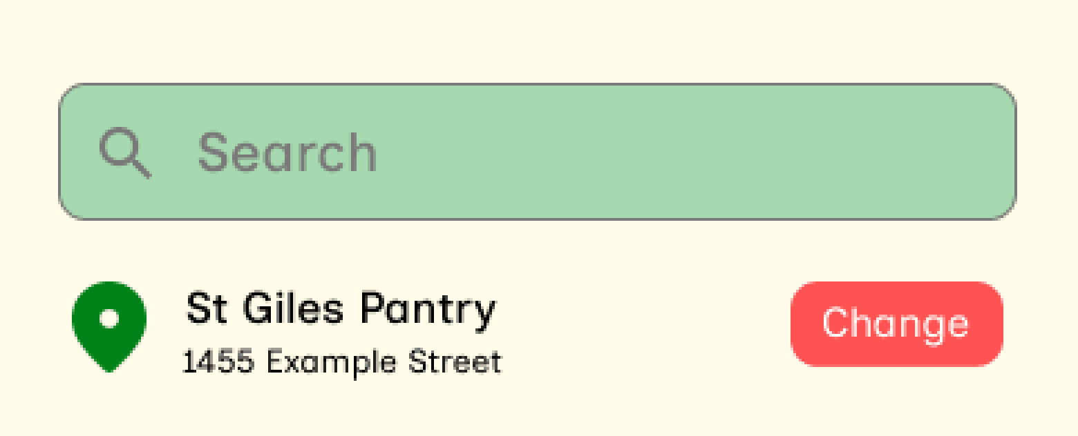
In the second round of usability testing, 2/6 participants found the search bar colors difficult to distinguish so I updated the colors for better clarity. This prompted me to audit my color choices using the WebAIM contrast checker to ensure that my design met WCAG accessibility standards.
At 13.16:1, the new colors pass the WCAG contrast ratio improving the search bar legibility for low vision users.
Color Accessibility Improvements

#A6D9AF
#000000
#A6D9AF
#797979
Contrast Ratio
Fails WCAG contrast ratio
2.72:1
Contrast Ratio
Passes WCAG contrast ratio
13.16:1
WCAG AA requires a ratio of at least 4.5:1 for text.
Final Design
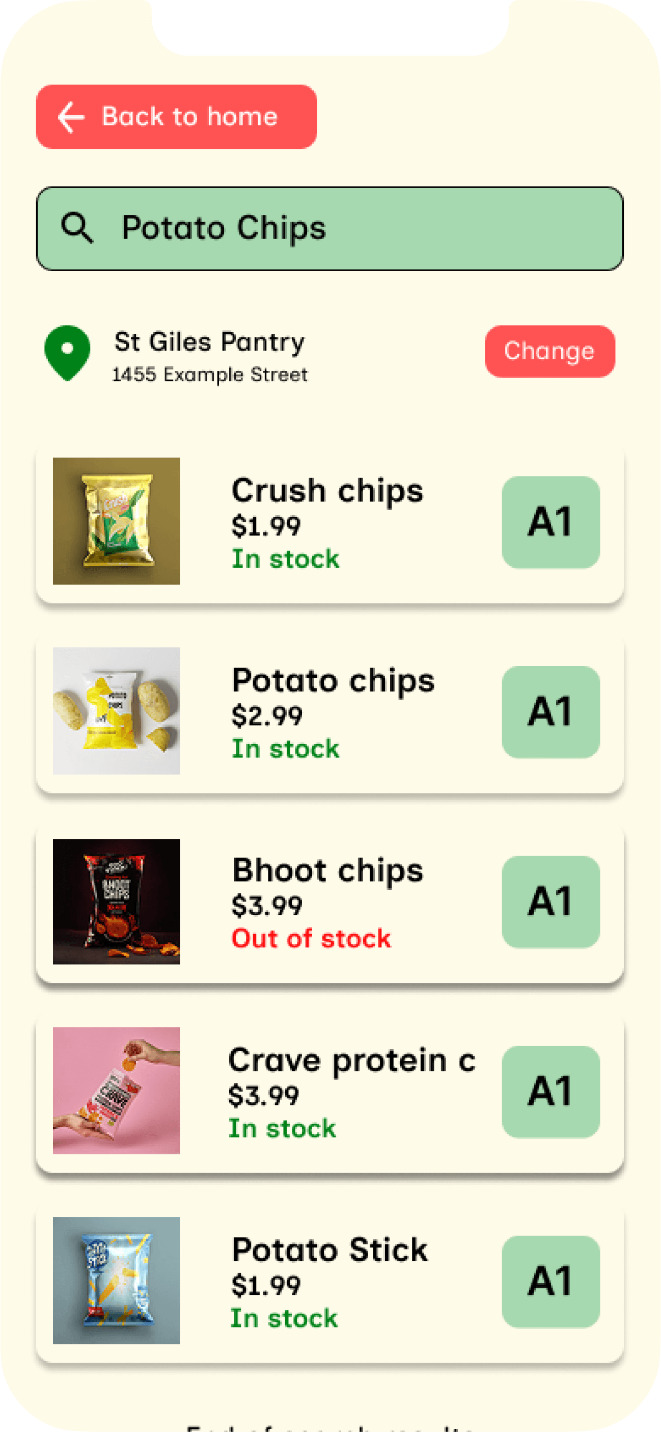
The final design allows users to search for an item, see its in store location on a map and check if it is out of stock directly addressing the top two frustrations from user research.


reflections and conclusions
what I learned
This project taught me the importance of early research data. My initial user research ended up with skewed results toward 18-24 year olds but I validated my findings by analyzing whether the responses outside of this range showed similar frustrations. If I ran this project again, I would recruit a broader group for my user research to give me more confidence earlier in the process.
next steps
Moving forward, I would like to conduct think aloud observations rather than unmoderated questionnaires for these usability studies to better understand the user experience of my app. I would also like to increase the functionality of my prototype by adding profile functionality and creation as well as being able to save items to find.